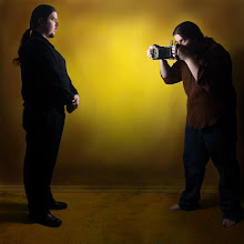

I've been trying to get work done more often lately to expand my portfolio. I hope to dedicate myself enough to get at least one work done a month. This may seem slow but I work full time and have other projects going on as well. Not only that but the process I use is very time consuming and I normally only use one picture from any one portrait session.
Currently I think it would be a good idea to bring out more emotion in my work and that is what this became about. The feeling in this piece is subtle enough to convey the emotion without being overpowering. I would like to do some more work with emotion in the future though as I really think I need to capture some stronger emotions.
The colors in this piece did turn out really well though. I enjoyed having to color the tie separate from the shirt as I feel they really compliment each other very well. Also they are brought out nicely again the opposing background. In the future it would be nice to try a portrait with and elaborate costume that would take even more effort to color. I would love the challenge of a complicated and intricate piece to color in this style. Also it would allow a lot more variety in the color of a single piece. Another piece I would like to work towards is a full nude. This would allow an intricate working with the coloring and tones of flesh. If anyone happens to know anyone that might be interested in doing a picture in this style with full nudity please let me know by emailing me at robhasacamera@gmail.com.
Saturday, December 13, 2008
Deep in Thought
Tuesday, November 18, 2008
Man with Knife

In this work I wanted the viewer to become an onlooker, a voyeuristic viewer powerless to prevent any action but too curious or consumed about what was happening to look away. The view from the back emphasizes this as animosity and leaves us asking who this person is or what emotions are occurring in this moment. More then anything I wanted questions to occur when viewing this piece. I wanted each person to interpret the image their own way, adding a piece of themselves to the image.
One thing I got to do while working on this piece was to streamline my process. I want to be able to easily reproduce this style to make it easier to refine and experiment with it. This gave me the freedom to do something different with the background. I enjoyed how it turned out and believe the stark red adds heavily to the strong emotions I’m hoping to invoke.
Monday, August 25, 2008
Blessing (test)

This piece is currently a work in progress. At one point I decided to experiment a bit and deviate a little from my regular style. I enjoyed the experimentation of it and like the results. The sepia tone turned out better then I would have expected and has several rich tones to it. The selective focusing helps to blur out the unnecessary details. it also helps to provide the work with a more antiquated appeal.
I may incorporate some of these techniques into future pieces. I am still gong to work on this one however and hope to Have a final version ready within a week or so.
Tuesday, August 5, 2008
Self Discovery

Been very busy lately. Just got done working on a side project for extra money. No it wasn't art related, however I'm using the extra money to get some new lighting equipment and a Lensbaby. Now that I'm done with that project for the moment I can get back to working on my photos.
I wanted to create a piece that made people feel strange. The person portrayed is staring at himself but doesn't give any indication of a reaction, he's literally frozen in place. This figure on the ground is slumped and pale leaving a question of whether he is alive or not which could be the very horror that the standing figure is facing in his mind. This work was more of a color experiment then anything else. I wanted to go a different direction in my color without making to drastic of a change at one time. It was very difficult to keep a neutral tone to the background and still have the color stand out strong like this. I really enjoyed how it turned out overall however and I will continue to experiment with color in future photos. Also when I get my new equipment I'll most likely try out different lighting techniques as well. Ill be very excited when I get the Lensbaby as it will afford a chance to try doing softer photos to see if they can work in this world that I'm trying to create.
Thursday, June 5, 2008
Claimed by The Hatter

I have always been fascinated with the world and the characters created in Lewis Carol's Alice's Adventures in Wonderland. More then anything though the Hatter at the tea party (aka the Mad Hatter) has held my interest. I love the unique personality and the unreasonable logic that he puts forth. I also enjoy the variations and diversity he receives when portrayed in other works, especially when he plays the role of a villain. So when trying to think of the title for a piece that involves madness the Hatter from Lewis Carol's book eventually came into mind. The person portrayed in this piece shows someone that has just broken the edge of his sanity. He is a normal person just like Alice that has gotten himself thrown into a world in which he doesn't belong. Stress and confusion eventually bring him over the edge and he finds that he can be just as inflicted with madness as any other character.
Color selection was difficult for this piece. Lately I have been trying to expand my color palette while striving to keep colors looking bright and passionate. It is especially challenging to create works as such and keep enough diversity to make sure they don't all blend together entirely. The red shirt again in this piece becomes a symbol for aggression and acts like a warning. The background compliments the shirt and helps to highlight the character further. With the colors I really wanted to create that out of place feeling and make the viewer feel that something is not quite right.
Thursday, May 22, 2008
Righteous Kill (The Slaughter of Man)

This photo continues the tale of the Self Appointed King portrait that I shot last year. Here our king has proclaimed himself a righteous man and found it to be his duty to rid his kingdom of the wicked.
Emphasis has been placed on the king in this work with the golden glow that surrounds him. He still carries the mark or royalty with the purple shirt he bears and everything about him is brighter. His pants are a better blue and his clothes are lighter in color. The man on the ground however is wearing much darker clothes. His pants on comparison aren't as bright and the dark red shirt he wears carries a foreshadowing of the blood that is to be spilled.
The thing I enjoy enjoy most in this photo is the pose that the characters are in. The king has a a great amount of tension on his form as he rises on the tip of his shoe before he strikes. The sword is pulled back as far as it will go like an arrow before its shot. The entire time though his face his calm and cool portraying him as someone that his only carrying on his duty. The man on the ground however is confused and struggling, the toes on his feet bent back as he struggles to get away.
The photo also has excellent angles that leads the viewer around the photo. The figures are connected were the hands cross paths and the viewer is guided to the man on the ground by the sword's tip. Altogether it creates a triangle shape that also helps to break up the frame.
I hope to keep up he story of the king in future works and also plan on expanding some of the other characters that I have shot as well.
Monday, May 19, 2008
Righteous Kill (BW Version)

I know it has been a while since I have posted last but I've been a bit busy. I went on a trip recently with some friends and I have also been working on my portfolio site. Not only that but I've been having problems finding models. In fact in my new portfolio site I am building a form for potential models, this way I can keep doing my photos. I'll make sure to post a link to the site when I have it done.
Currently I'm working on the photo that you can see to the left. Before we began the idea was that I was going to be knighted but part way through the shoot the idea changed quite a bit. I'll talk more about this photo once I get the color version done. The title may end up changing by then too but we'll see.
Friday, February 22, 2008
Melancholy Lust

This one turned out a lot different then I originally planned. I was going to do a portrait where my wife appeared in it twice but after shooting for a bit this started to develop instead. I really enjoyed how it turned out though, I had to spend quite a while making sure that every detail was right. The background colors were an experiment. In this I'm attempting to do more then just single color backgrounds so I can diversify my work. Also there is a lot of play with the skin tones to make them contrast from each other. My wife's skin tone in this is very pale and brings thoughts of purity overshadowed by a morbid feeling. I believes this plays well with the overall aggressive sexual part that I play in the picture and helps provide this image with its dual meaning. The background also fuels this duality with its brightness sounding an otherwise dark scene.
Here is another image from this photo session that I enjoy even though I don't believe in fits in the series at the moment. This was actually a test shot from the shoot to get the lighting worked out but it ended up turning out really well. I ended up using it to test some new techniques that I'm developing. I may work more on this one later and repost it as a self-portrait in this series.
Wednesday, February 6, 2008
The Harlequin at Play

I know its been a while, but I was finally able to get this one done just yesterday. Things have been busy lately and I just didn't have a chance to get it done any sooner.
Right now I'm playing with the idea of double portraits as a way to some multiple personalities. I enjoyed the idea of the Harlequin because to me he's a prankster and at the same time can be very serious. However serious he may become though he's always playful and enjoys pranking and showing off, even at his own expense. This image displays that dual personality and evokes feelings of curiosity and sadness that are both present within the character. One sad lost in a bitter emotion but another side of the same individual is unable to understand the feeling and is even of the verge of interrupting what should be a private moment.
This work shows a vibrant display of colors that remind me of works by Gilbert and George*. I struggled with this one to keep the colors clean while trying to give them a depth that draws the viewer into the image.
I enjoyed doing this picture a lot and I am also working on a triptych using some photos from the same shoot. I also plan on experimenting a bit more and will post the results as I finish them.
*some images on the the Gilbert and Geaorge site may be offensive to some people, view with care and not at work
Saturday, January 5, 2008
Saint No. 2

Just finished this image. I'm really happy with how this one turned out. I believe that this image really captures the essence of the religious glow and the halo works quite nicely with it. I've been reading a lot about the halo as a icon on wikipedia, and think I will end up doing a few picture similar in this nature.
I believe the lighting is the strongest part of this photo and I'm glad that I did light test before the shoot because it made things so much easier. The cloth that is draped around the figure also turned out well as a result of this and makes the figure more three dimensional and real. The colors are also very strong and helps to separate the image from the background. The background color also brings to mind fire, as if the figure is surrounded or baptized by a holy flame.